You walk into your bathroom twice a day at least, at the two moments that open and close it. Most people pick the tile first and discover the mood afterwards. Reverse that order and the decision gets easier.
Colour psychology is the study of how a shade changes the way a room feels. In a bathroom it carries more weight than anywhere else in the house. Tiles cover the floor, four walls and often the ceiling line. There is no sofa, no curtain, no rug to soften the choice. What you tile is what you feel.
Decide the feeling before you open a shade card
Two questions do most of the work.
- What does this bathroom need to do at 7 am?
- What does it need to do at 11 pm?
A guest powder room, a family bathroom and a master ensuite answer differently. Once you have the answer, thousands of designs collapse into one palette and two or three collections.
Indian light and water change the rules
Most colour advice online is written for softer, cooler daylight. Conditions here are different, and they change what a tile actually looks like on your wall.
- Daylight is strong and warm through most of the year. It pushes beige towards yellow at noon and cools grey towards blue at dusk.
- Many bathrooms have one small ventilator, or none. Artificial light does the work, so the colour temperature of your LED matters as much as the tile. A 6500K white flattens a warm travertine. A 3000K warm white makes a cool grey look muddy.
- Hard water is common across north and west India. Mineral scale leaves pale marks that show far more on deep, dark surfaces than on mid-tones.
- Most urban bathrooms run 35 to 60 sq ft. Colour has to buy space, not spend it.
Seven palettes, and the Somany collections that deliver them
White and ivory: clarity
Feeling: awake, clean, uncluttered.
White returns light better than any other shade. In a compact bathroom with a single ventilator, that is the difference between a room that feels tight and one that feels open.
The risk is a clinical finish. Solve it with veining and texture instead of a second colour. Elita reimagines statuario and onyx through digital engineering, so a white wall can carry movement without carrying a second colour. Citadel Ivory 240 Quill Glam and Statuario Branca 240 Quill Glam are the two we specify most often for a full-height feature wall behind a vanity.
For a straightforward field tile, Max 180 Kristen Bianco FP from the Duragres Harmony collection gives you a quiet white with a subtle texture, and Colorato Bianco 180 Gritstone MT adds a jute-like grain if you want white with tactility.
Somany shortcut: Elita for the feature wall, Duragres Harmony for the field, Glosstra from the Ceramica range when you want gloss to push light around a small room.
Warm neutrals: comfort
Feeling: grounded, relaxed, easy to live with.
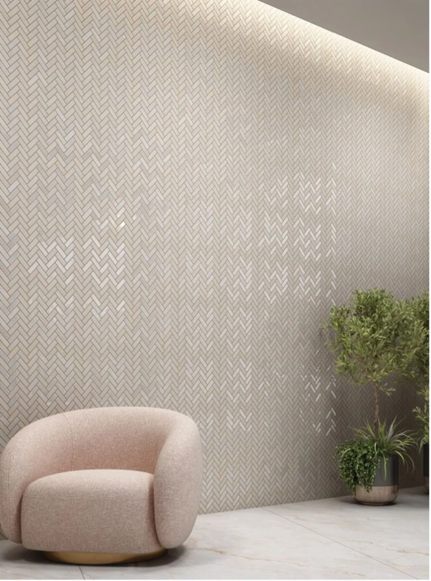
Ivory, sand, beige and travertine lower the contrast in a room. The eye stops jumping between surfaces and the space reads calm. This is the palette behind most spa and boutique hotel bathrooms, and it is the most forgiving choice in an Indian home, because warm neutrals hide dust and hard-water marks better than either extreme.
Two Somany routes here. Duragres Harmony is the safe, coordinated one: Max 180 Pariso Beige FP and Max 180 Prime Atlas Crema FP are built around a cohesive palette, so wall and floor stay in the same family without matching exactly.
The Senso collection is the more textural route. It recreates stone shaped by time, using Carvo synchronised vein technology so the surface texture follows the printed design. Malta Natural 180 Carvo and Malta Oyster 180 Carvo give you a warm neutral you can feel as well as see, which is what stops a beige bathroom from looking flat.
Somany shortcut: Duragres Harmony for a coordinated warm scheme, Senso with Carvo when you want depth in the surface itself.
Grey and greige: control
Feeling: composed, urban, quiet.
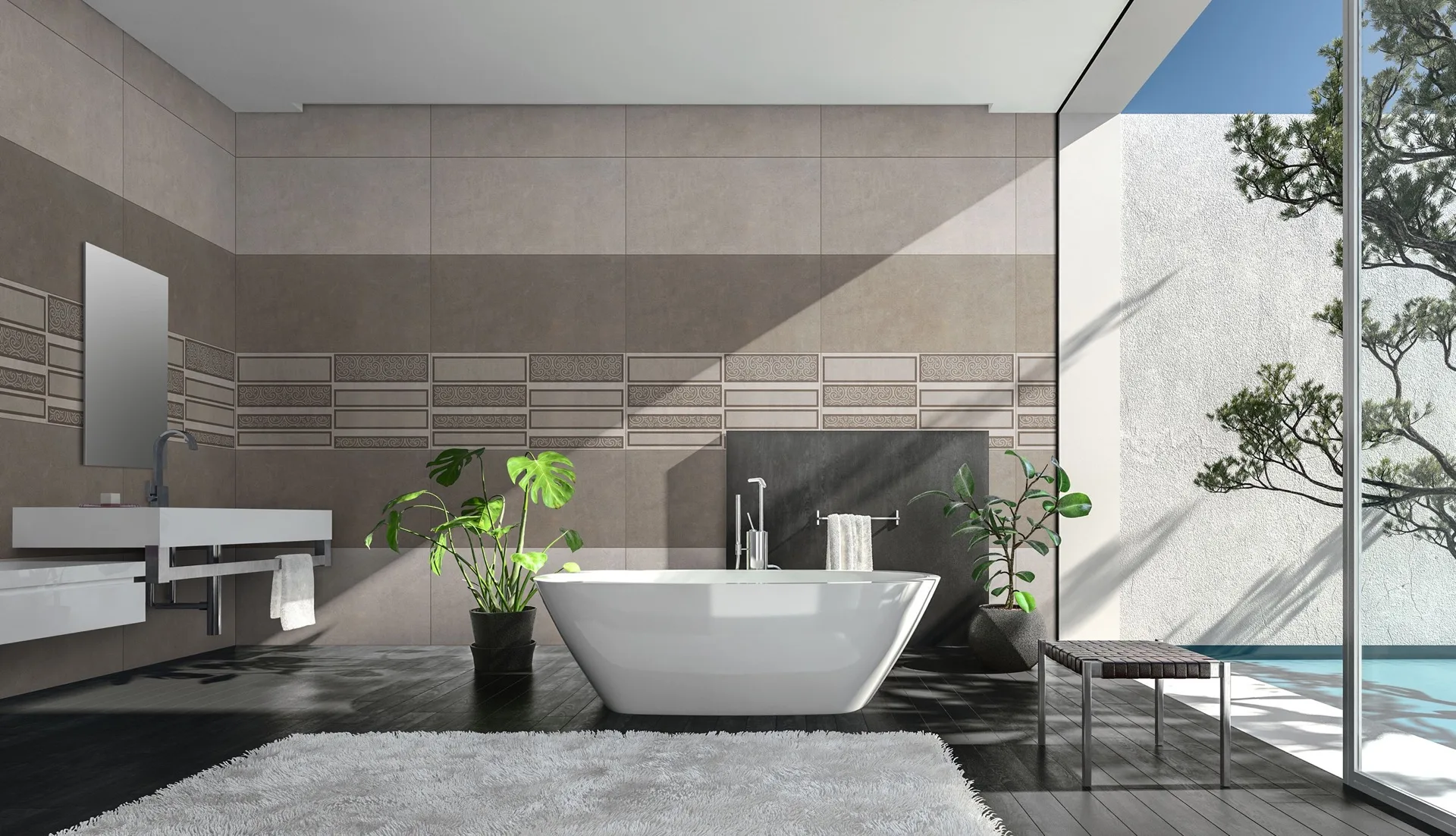
Grey became the default in Indian apartments for practical reasons. It handles hard water better than white and reads more contemporary than beige. Greige, grey with a warm base, fixes the coldness that puts some people off.
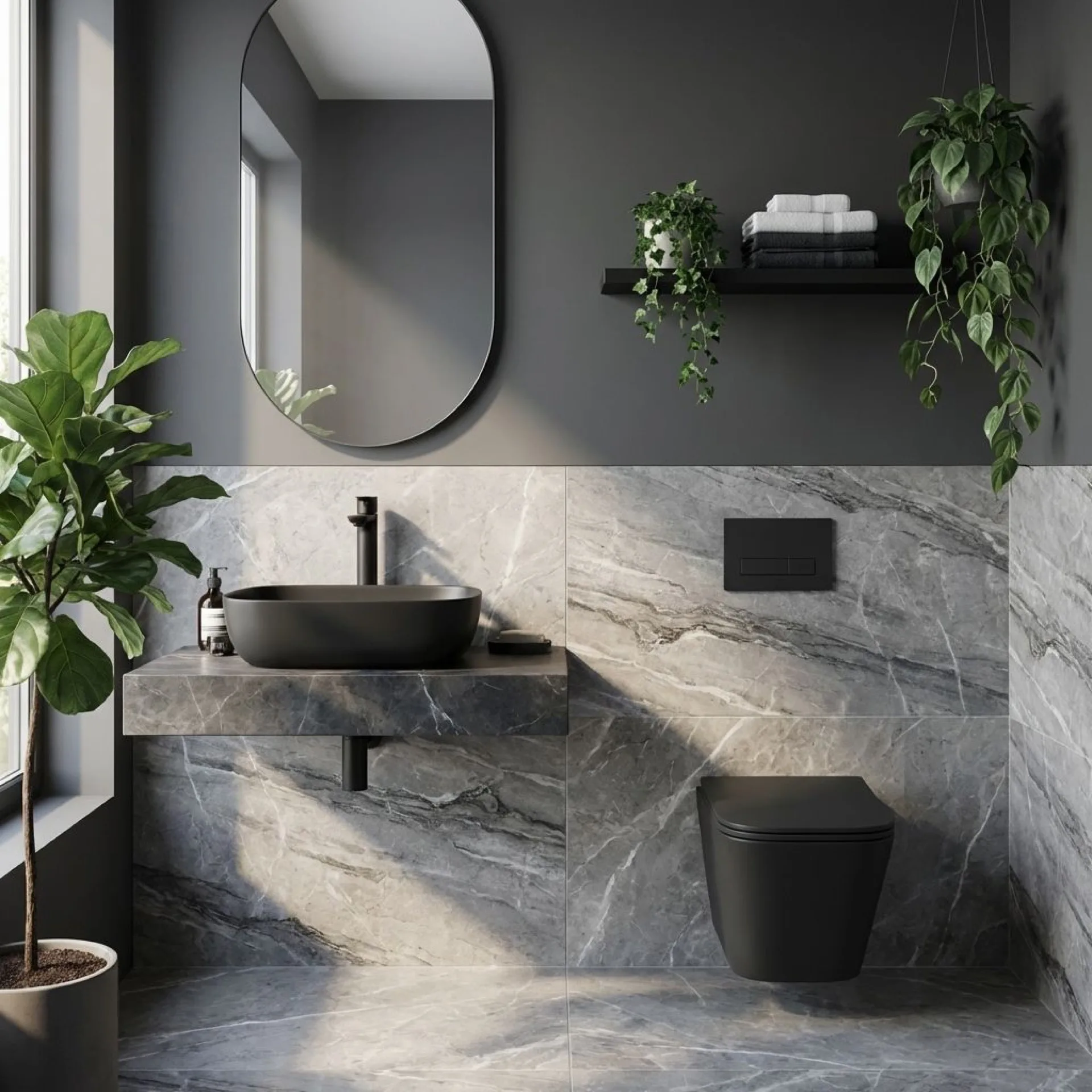
Duragres Harmony covers the everyday end with Max 180 Reggio Grey FP and Max 180 Ava Armani Grey FP. Prion Light Grey Matt is the softer, lighter option for a small bathroom where you still want the wall to return light. For a grey with real drama, Capitol Grey Pro 240 FP V2 from the Coverstone Luxury Polish range delivers high-gloss clarity across a large surface, best used on one wall rather than four. Malta Grey 180 Carvo takes grey in the tactile direction instead.
Somany shortcut: Duragres Harmony for the field, Coverstone for a polished statement wall, Senso for texture.
Green: restoration
Feeling: balanced, restful, fresh.
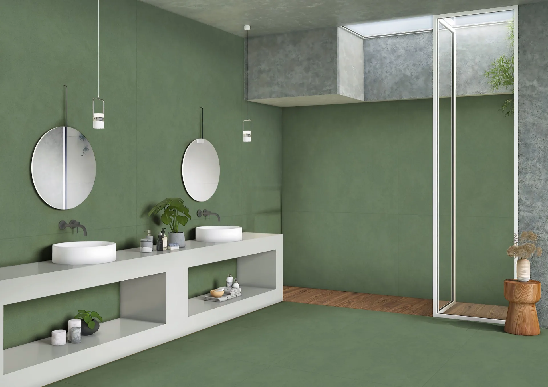
Green is the shade people describe as calming most consistently. It sits at the centre of biophilic design, which brings natural cues indoors to support wellbeing. In a bathroom it works because it reads fresh without reading cold.
Light sage suits a whole small bathroom. Deep bottle green is better on one wall, behind the mirror or inside a vanity niche, where it adds depth without closing the room in. In the Somany portfolio, green sits mainly in the Ceramica wall tile collections, so filter Vistoso and Glosstra by Green in 300x450 mm and 300x600 mm, then bring the floor back to a warm neutral so the green stays the feature.
Somany shortcut: Ceramica (Vistoso, Glosstra) filtered by Green for walls, Duragres Harmony beige or grey on the floor, Italmarmi mosaic or subway pieces for a niche.
Blue: calm
Feeling: peaceful, centred, cool.
We connect blue to water without thinking about it, which is why it never looks out of place in a bathroom. Pale blues lift a morning routine. Indigo and deep teal turn an ensuite into somewhere you want to stay a while.
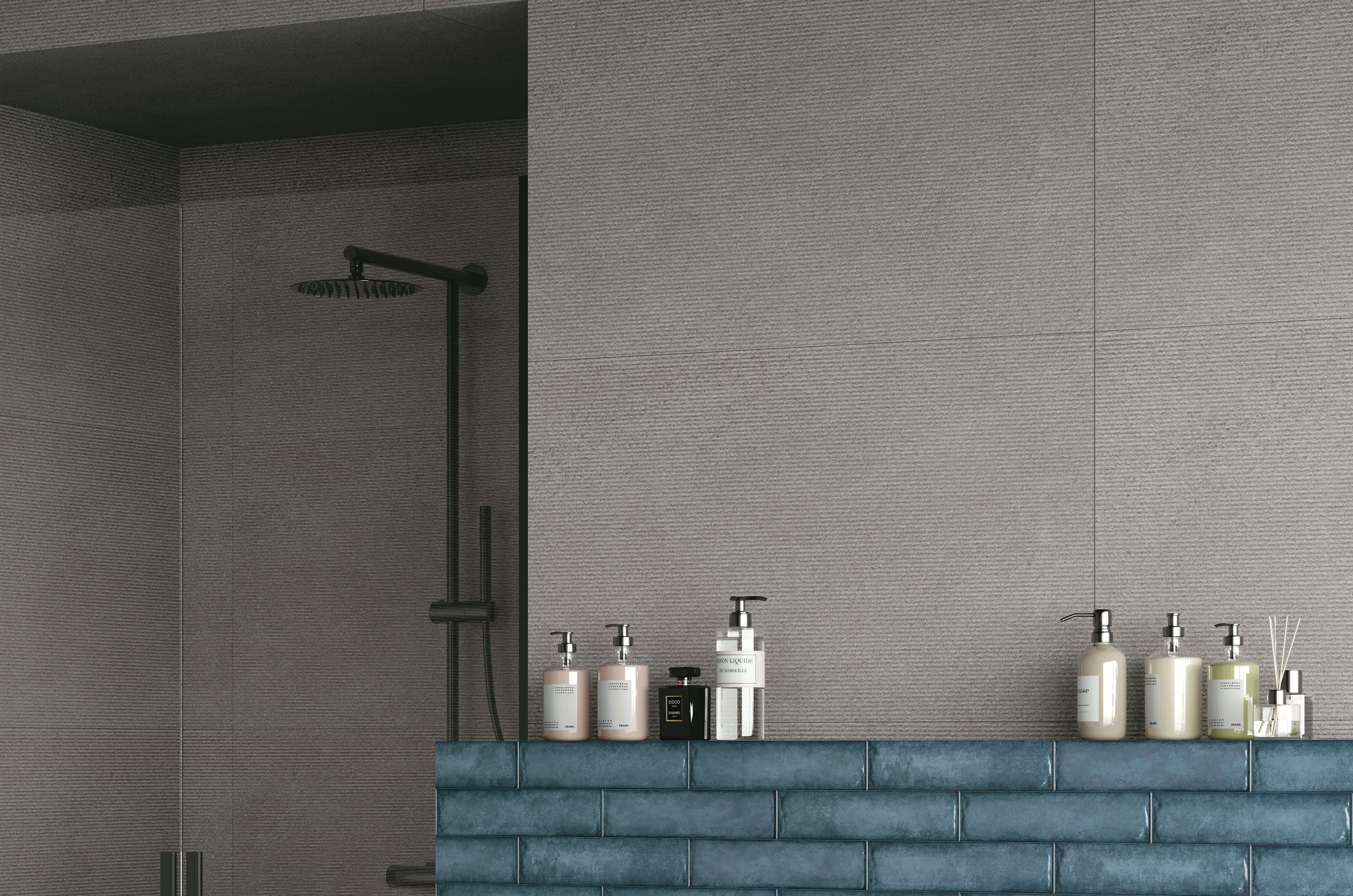
Colorato is the collection built for exactly this. It takes iconic architectural hues and gives them a distinctive jute-like gritstone texture, so the colour arrives with a matte, woven surface rather than a flat printed one. Colorato Blue 180 Gritstone MT is the reference piece. Used across a shower wall with an ivory field around it, it does more work than a much larger area of plain blue would.
Somany shortcut: Colorato for a textured, saturated blue; Ceramica Vistoso in blue for lighter, everyday coastal tones.
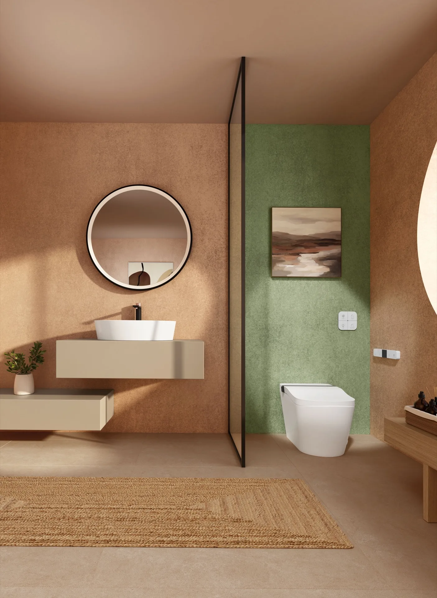
Terracotta, clay and copper: warmth
Feeling: warm, personal, lived-in.
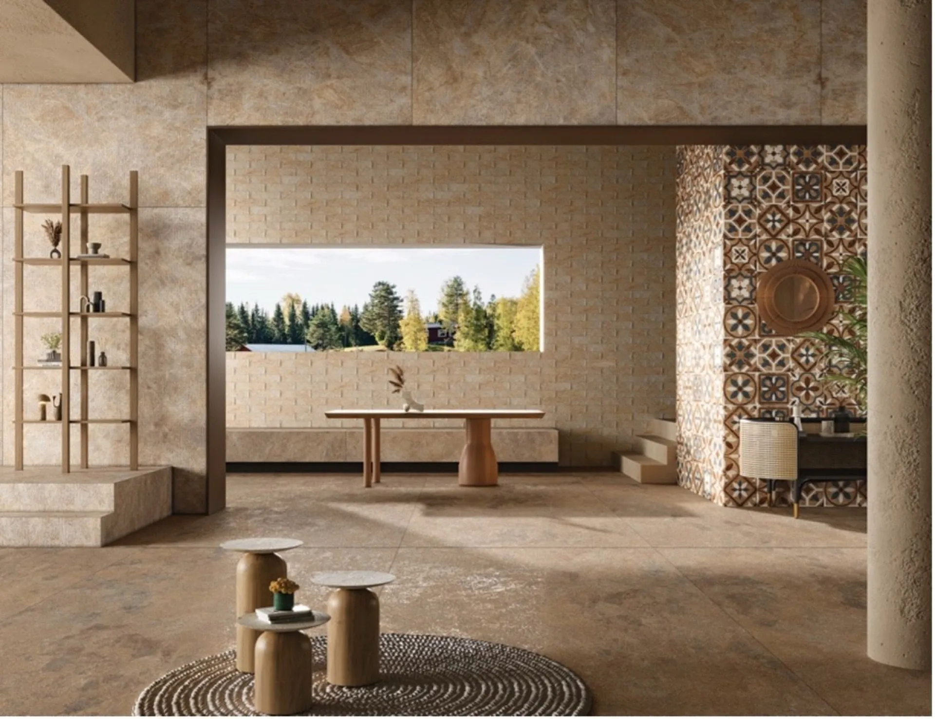
Earthy clay tones carry a handmade character a polished surface cannot. They add personality in a small footprint, which makes them a strong choice for a powder room or a guest bath where heavy wear is not a concern.
Colorato Red 180 Gritstone MT gives you the flat, sun-baked clay tone with a woven texture. Castle Copper 180 Shape from the Senso collection goes further: ShapeTech builds relief directly into the surface, so a single wall reads as a piece of architecture instead of a colour choice. Keep the rest of the room quiet when you use it.
Somany shortcut: Colorato Red for flat clay, Senso with ShapeTech for a sculpted copper wall, unglazed Italmarmi accents.
Brown and wood tones: grounding
Feeling: secure, warm, settled.
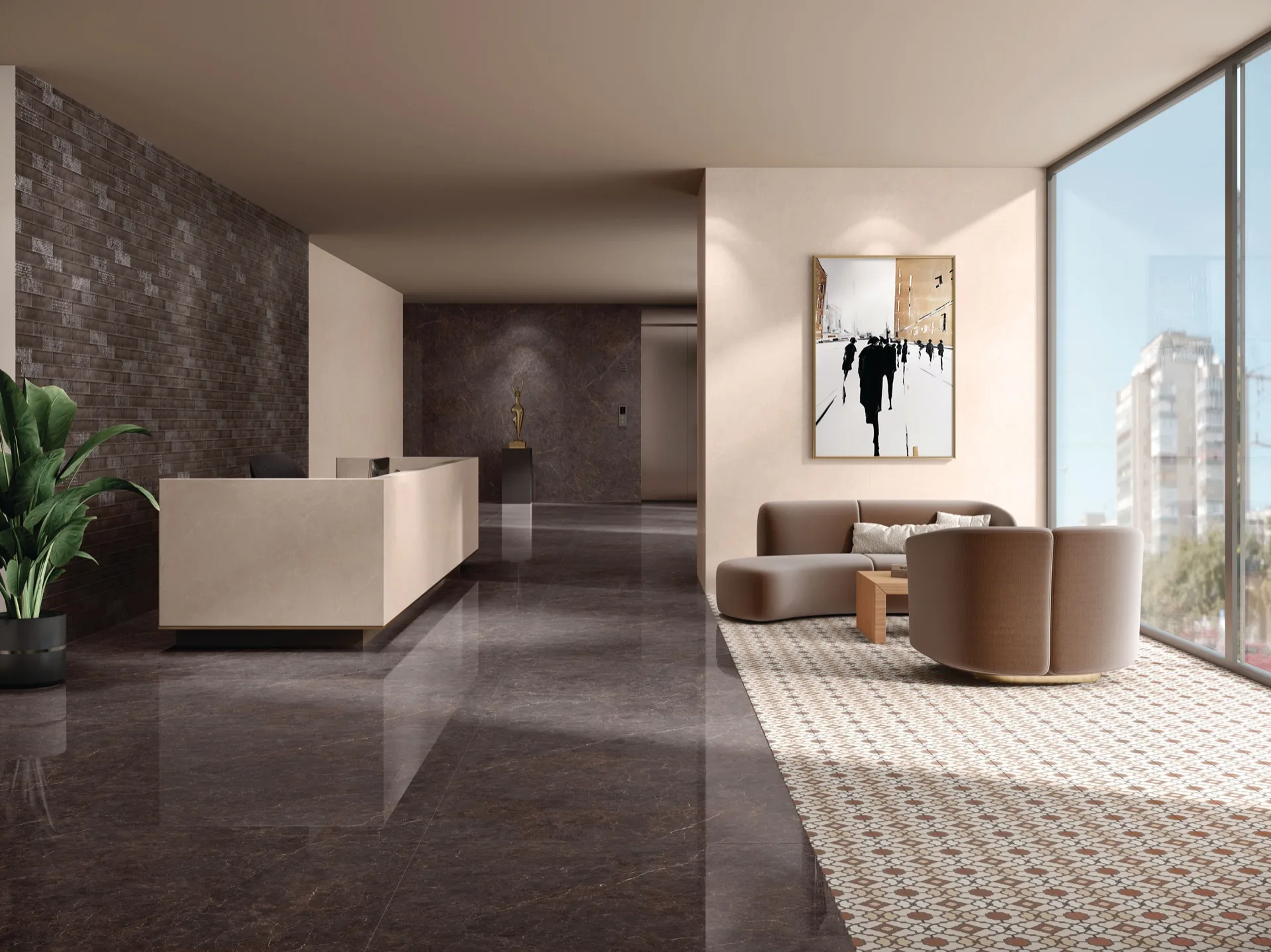
Brown is back in bathroom design because it does what black cannot. It adds depth while staying warm. Amazona Bruno 240 Quill Glam from Elita is the marble-led version, with movement across a large surface. For the timber look, Wood Essentia in the Ceramica range runs in elongated 200x1000 mm and 200x1200 mm planks, which give you the visual of wood with the water performance of a ceramic tile.
Somany shortcut: Elita for brown marble depth, Ceramica Wood Essentia for plank-format warmth, one stone-look feature wall.
Black and deep tones: punctuation, not a palette
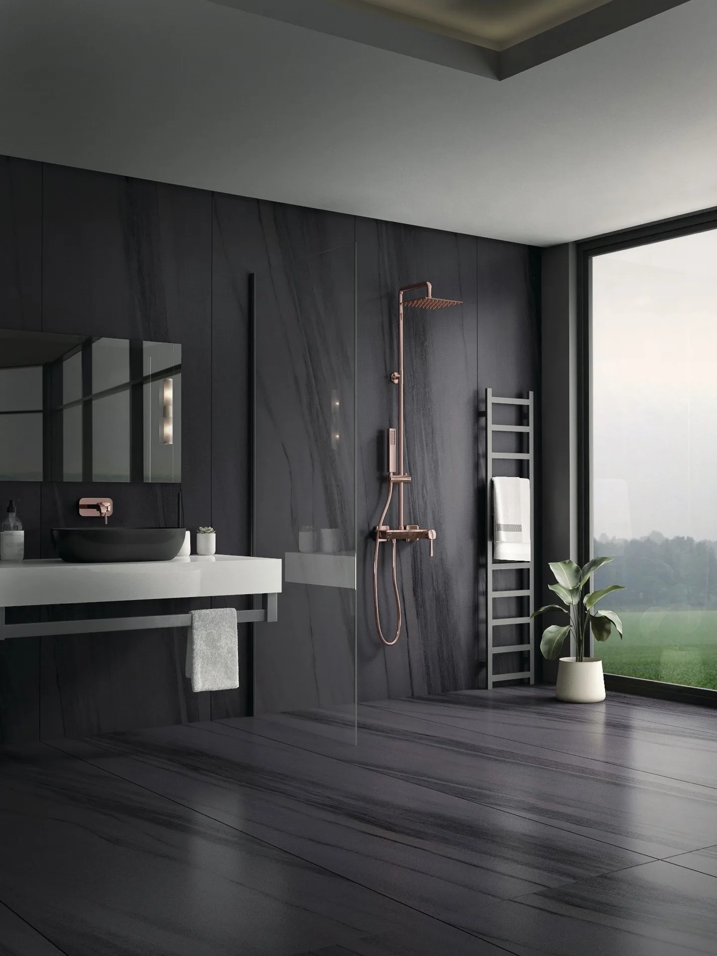
Black earns its place as an accent. A shower recess, a niche, a border, a contrast grout line. Wrapped across a 40 sq ft bathroom it closes the room in and shows every water spot. Onyx Crystallo EL 180 Quill Soft and Breccia Furossa 240 Quill Glam from Elita give you the drama in a controlled dose, on one wall, with a lighter field around them.
See it before you commit
A four-inch sample tells you the colour. It does not tell you the room. Three steps close that gap.
Start with the Somany tile visualizer. Use 2D Studio for a quick preview in a preset room, Panorama for a 360-degree view, or Your Space Studio to upload a photo of your own bathroom. Shortlist there, then use the tile calculator to size the order before you speak to anyone.
Then see the surface in person. Visit a Somany Experience Centre or use Find Near Me to locate an authorised dealer. Screens shift gloss and colour. Elita’s veining, Senso’s Carvo texture and a Quilltouch matte all read differently in the hand than on a phone.
Choosing a bathroom tile is not about picking the most popular shade of the year. It is a decision about how you want to feel at the start and the end of every day. Browse the Somany bathroom tile range and filter by colour, size and finish to build a shortlist worth living with.